
How this dashboard works:Outbound campaigns (initiated by Pearl) offer more data, while inbound campaigns show a lighter set of insights. All data reflects Pearl’s automated voice interactions, not human agents.
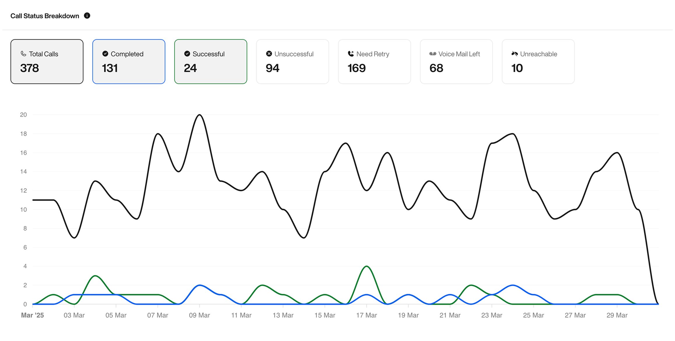
Key Metrics Overview
Total Calls: Number of call attempts made during the selected period.Completed: Calls where someone picked up and interacted with Pearl, regardless of outcome.Successful: Calls that achieved the success condition defined for the Pearl (e.g. booking, confirmation, etc).Unsuccessful: The conversation happened, but the user declined or failed to reach the intended outcome.Need Retry: The lead picked up, but the conversation was interrupted or incomplete. These are flagged for retry.Voice Mail Left: Pearl left a voicemail.Unreachable: No one picked up or the number was unreachable.
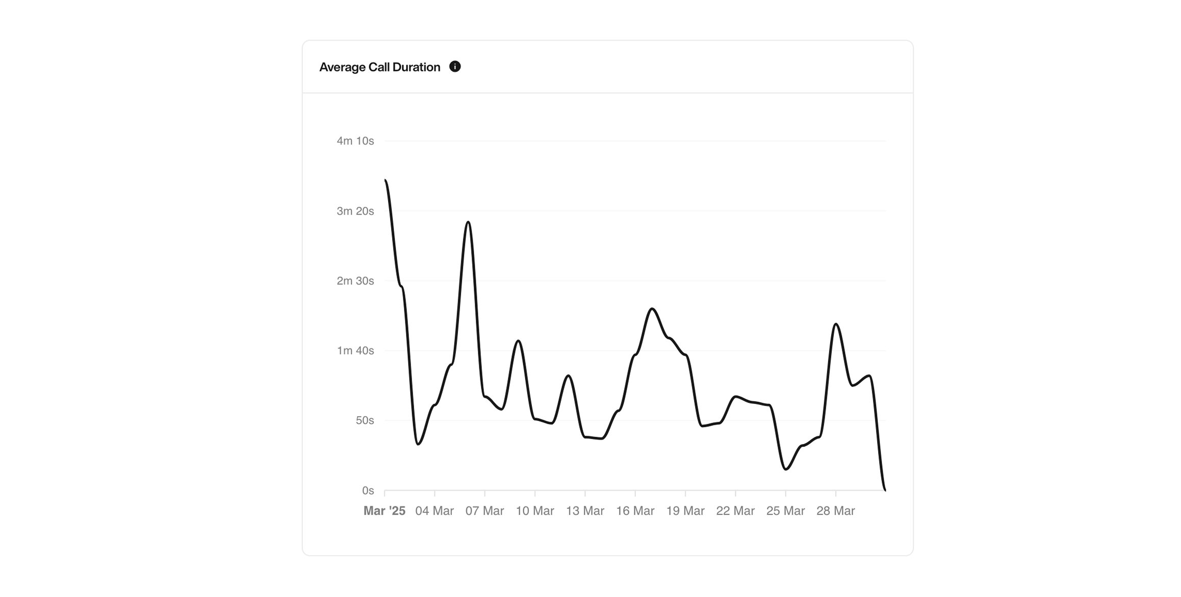
Average Call Duration
This graph shows the average duration of calls from the moment the person picks up or starts interacting with Pearl. Useful to:- Detect drop-offs
- Monitor engagement quality
- Measure attention span
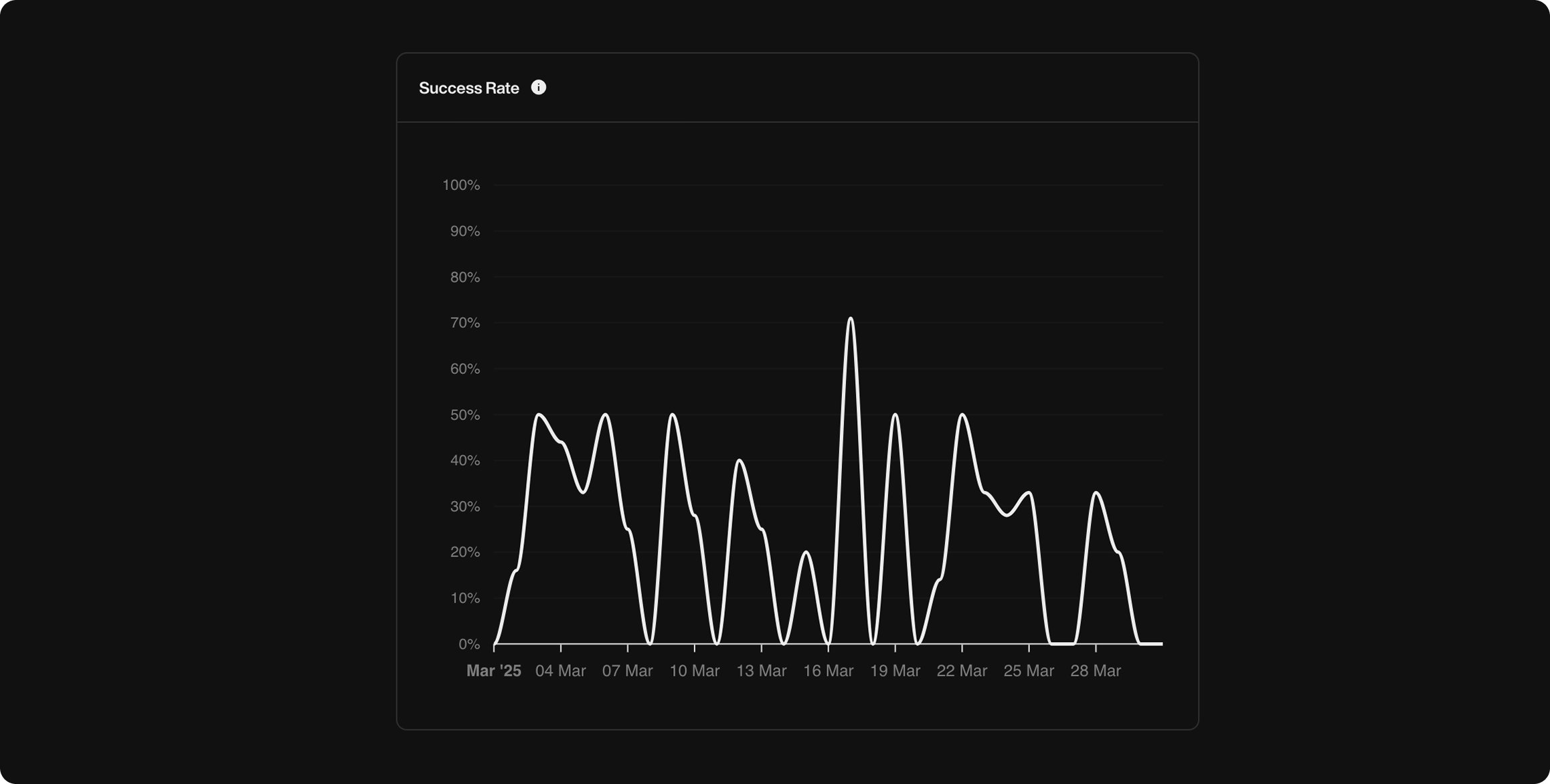
Success Rate
This shows the percentage of calls that achieved the goal you defined when creating your Pearl, like booking a meeting, confirming information, or anything else you set as a success.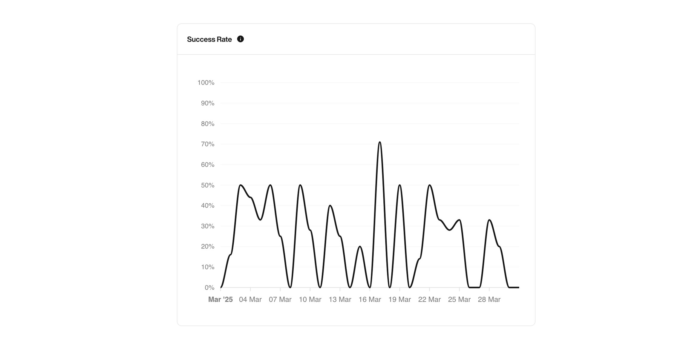
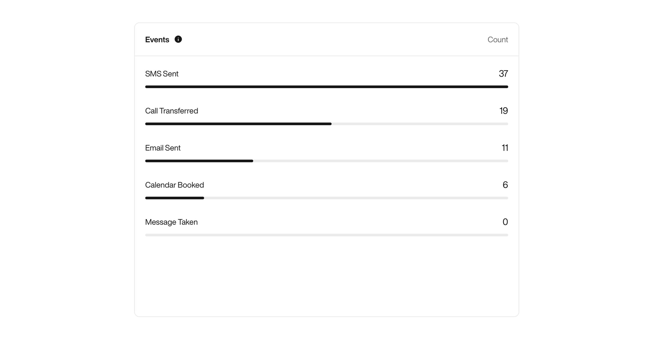
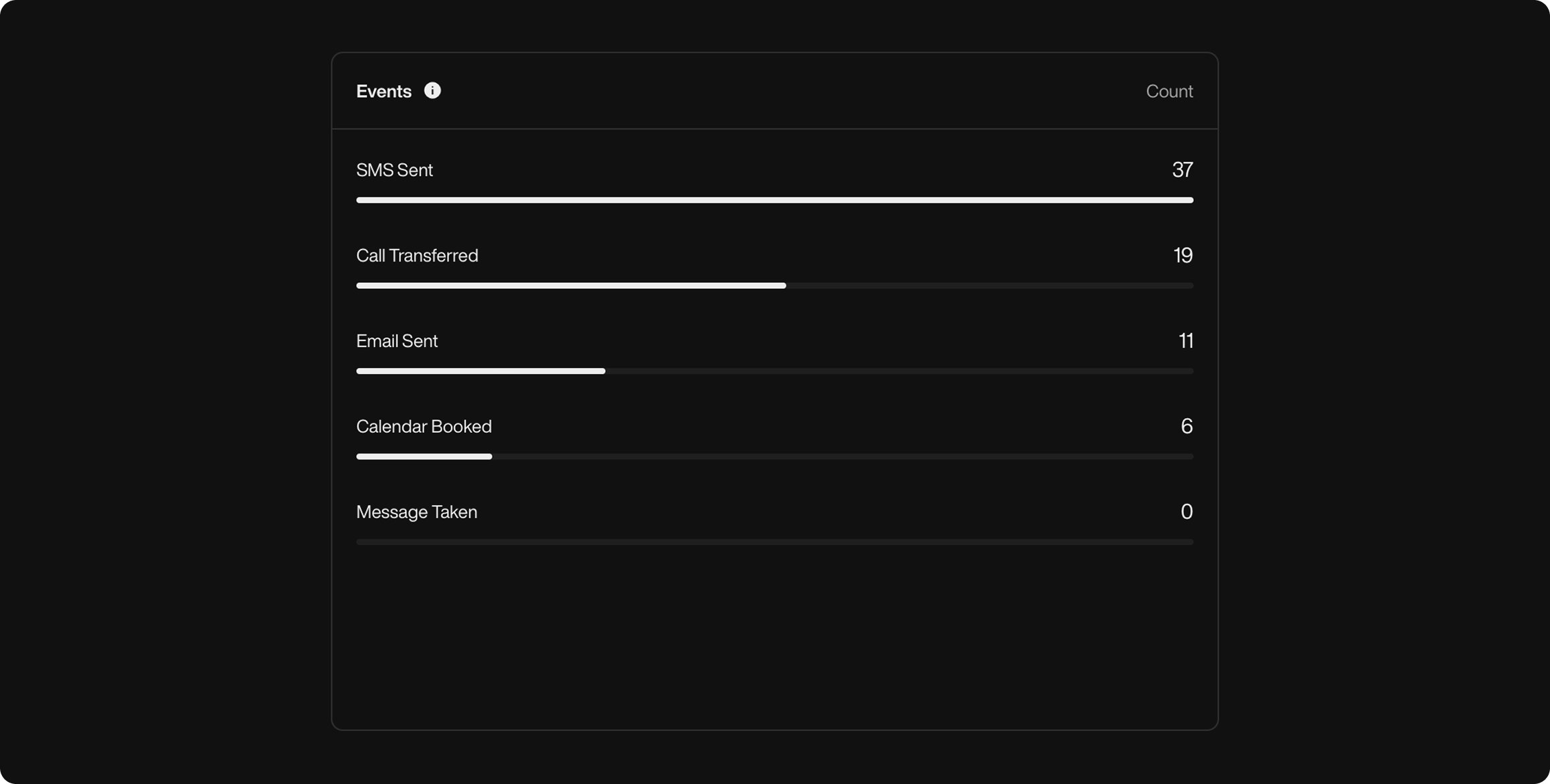
Events Triggered
See all the actions triggered by Pearl during conversations, and how many times each one occurred. For example:- Call Transferred
- SMS Sent
- Message Taken
- Calendar Booked
- Email Sent
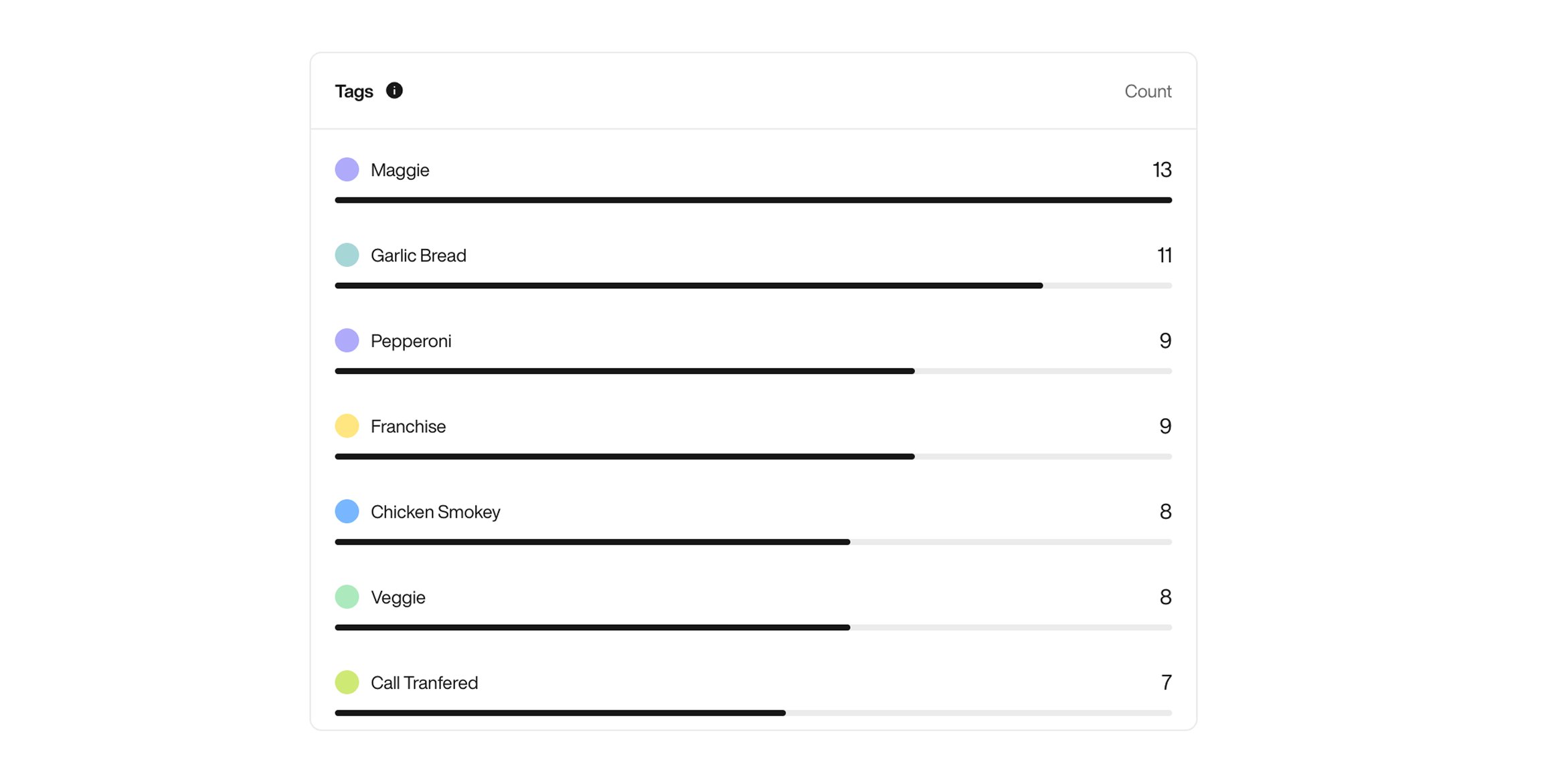
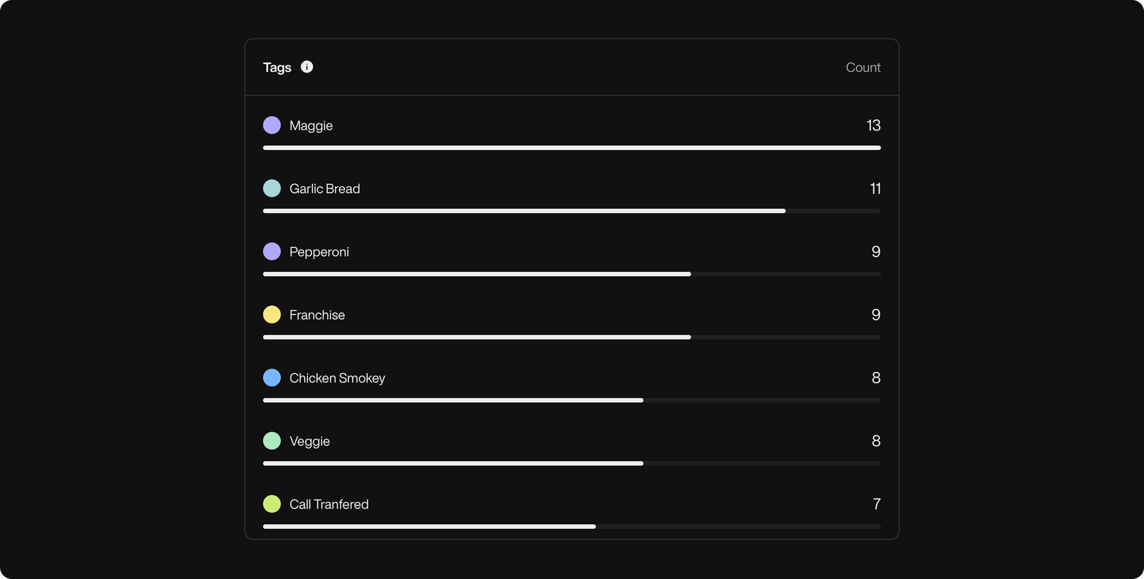
Tag Frequency
These are the custom tags you defined when creating your Pearl. They help you track key topics, intents, or outcomes during calls, like"No", "Transfer", or "Link".
Tags are applied automatically based on what the user says or how the conversation flows.
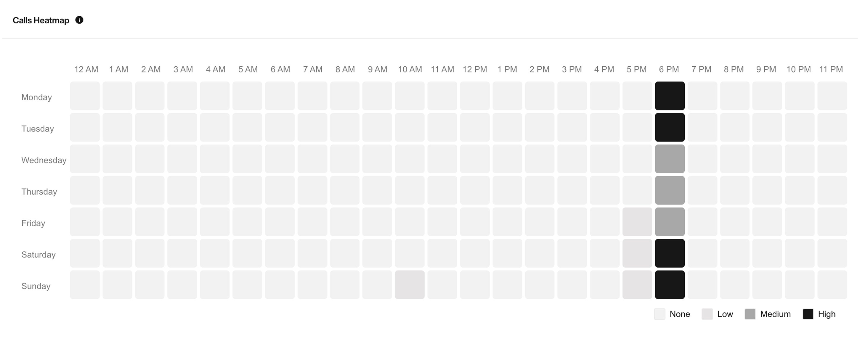
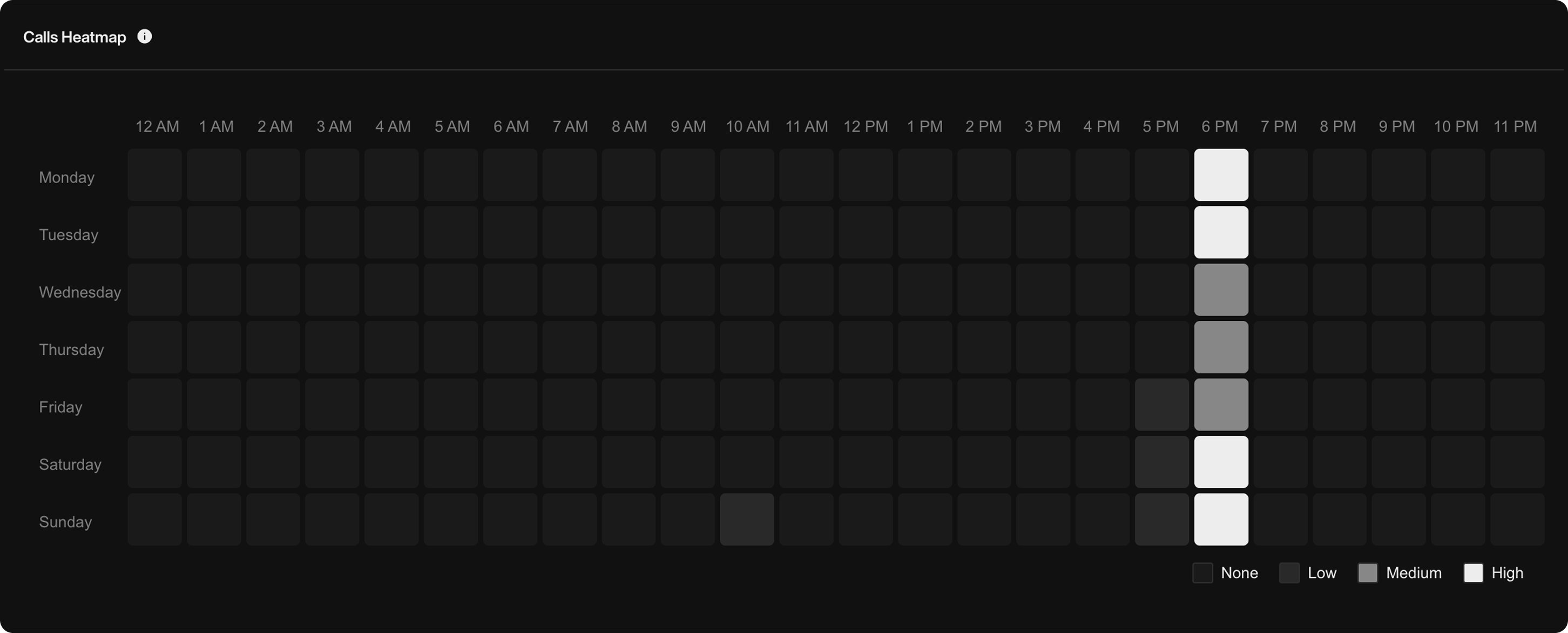
Calls Heatmap
This heatmap shows you when people are most active, either calling you (inbound) or answering your calls (outbound).- White = high activity
- Grey = medium
- Black = none
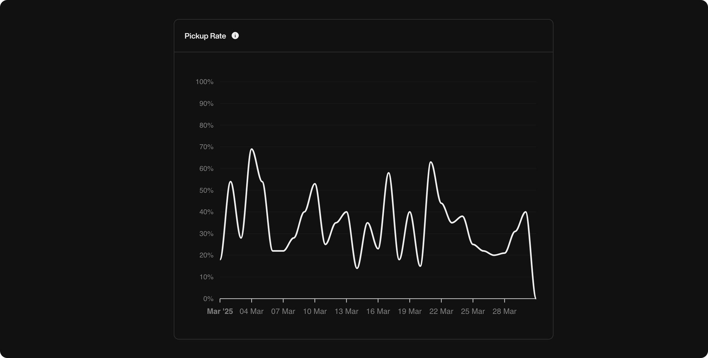
Pickup Rate
This graph shows the percentage of outbound calls answered by your contacts. It helps you understand how reachable your audience is and optimize calling hours.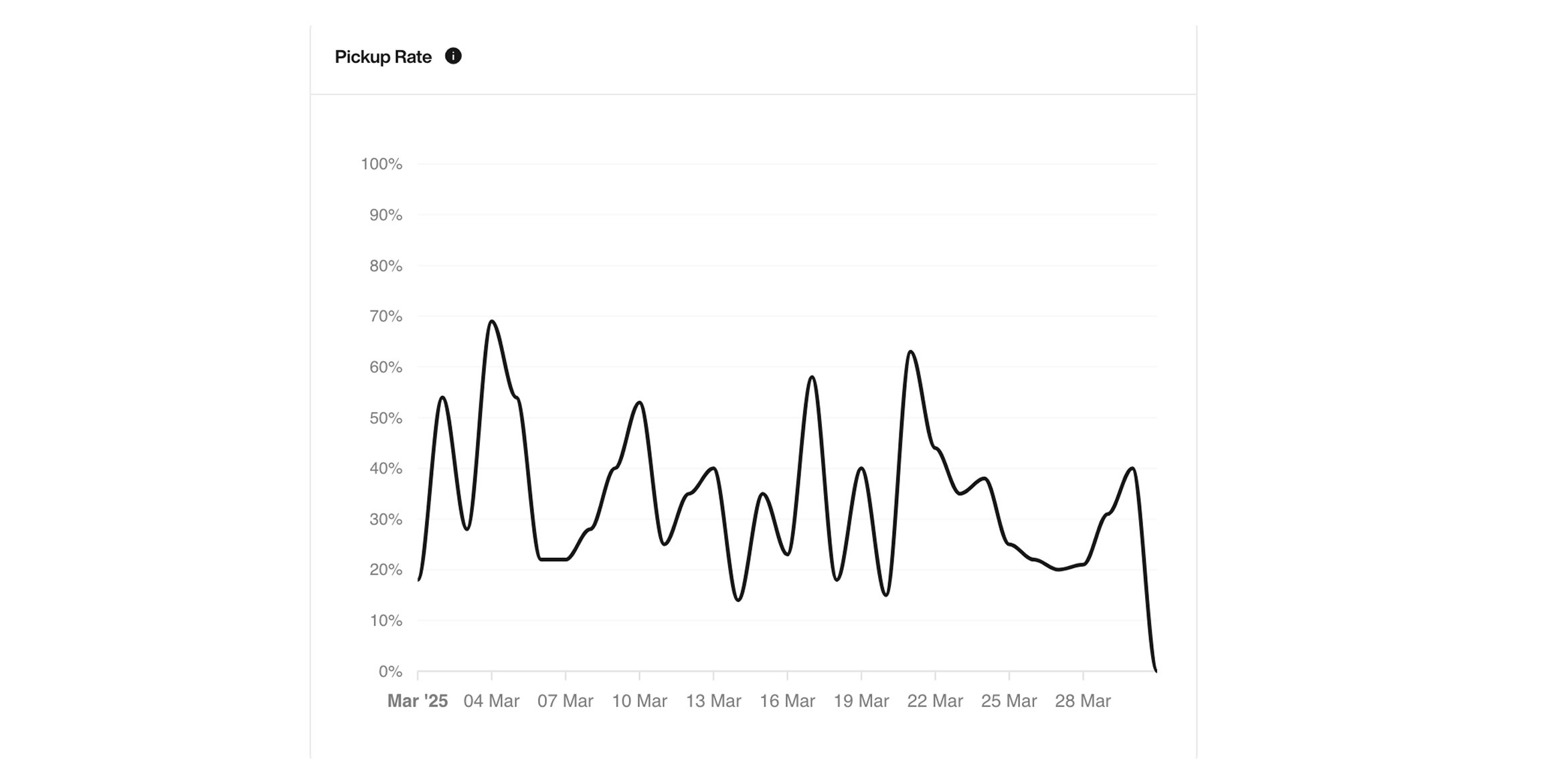
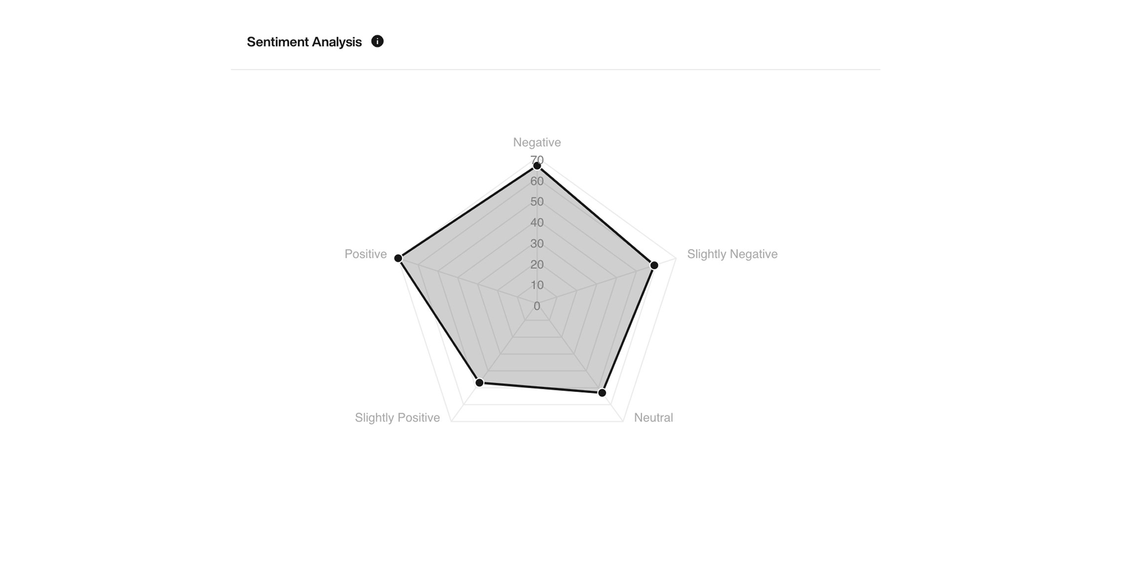
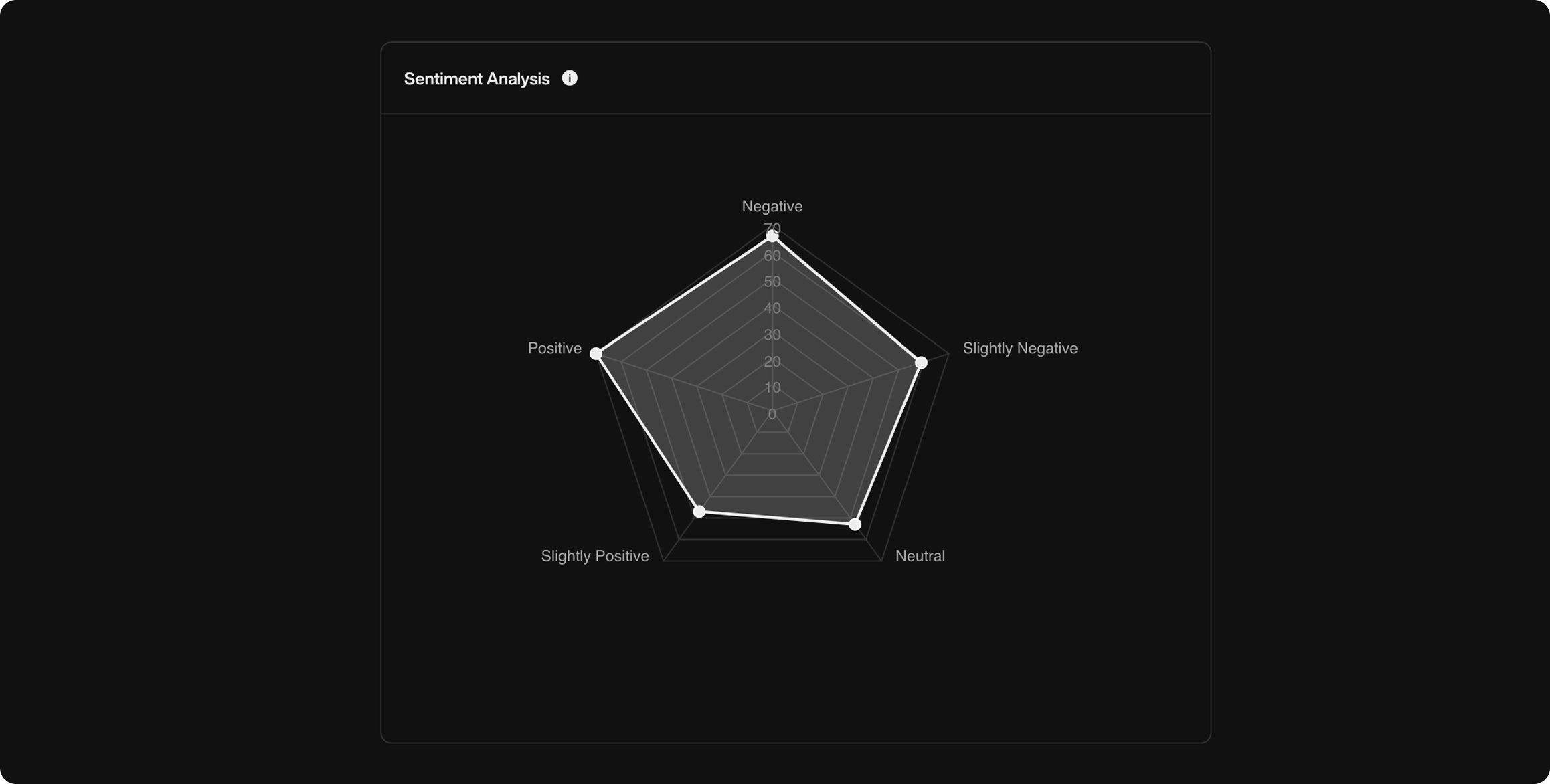
Sentiment Analysis
This chart reveals the emotional tone of conversations based on customer responses:- Negative
- Slightly Negative
- Neutral
- Slightly Positive
- Positive
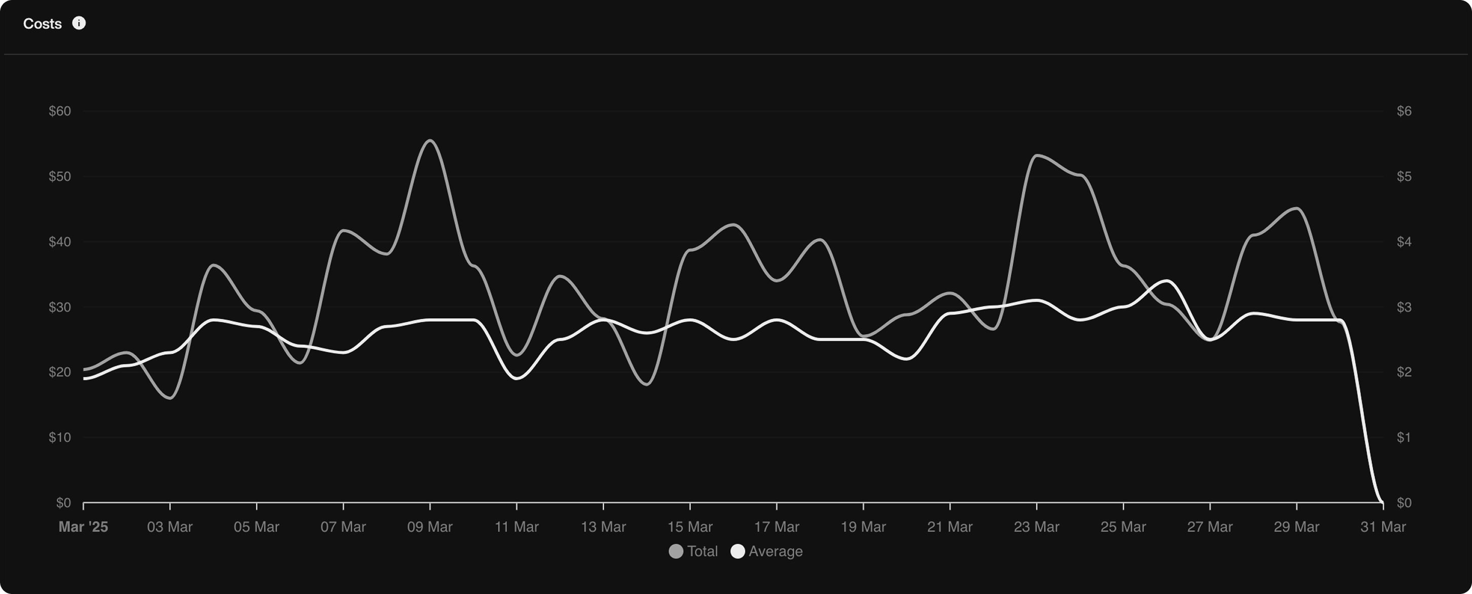
Cost Breakdown
See your total and average call costs over time to understand how your usage impacts your credit.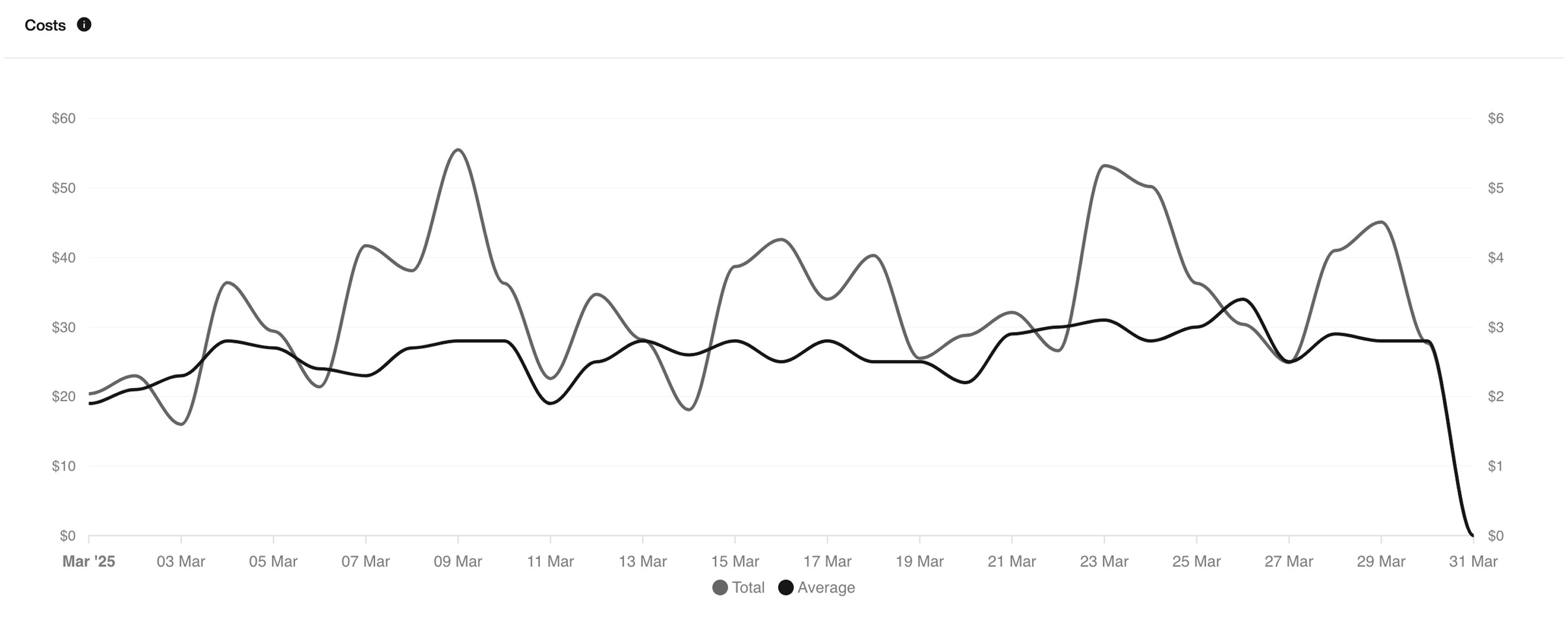
Differences: Inbound vs Outbound
| Feature | Inbound | Outbound |
|---|---|---|
| Call Initiation | By user | By Pearl |
| Pickup Rate | Not shown | ✅ Visible |
| Heatmap | ✅ | ✅ |
| Success/Retry Tags | ✅ | ✅ |
| Sentiment Analysis | ✅ | ✅ |
| Cost Breakdown | ✅ | ✅ |